Digital accessibility is like a good cup of coffee: everyone should have access to it.
Yet, many websites still make mistakes—sometimes big ones. And these digital accessibility errors can literally exclude millions of users. Not ideal, right?
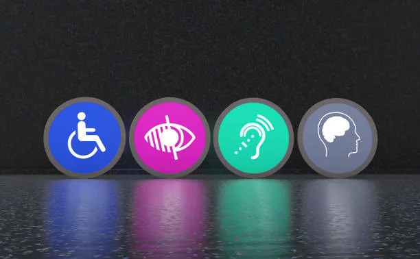
So let’s break it down. Here are 10 common web accessibility mistakes you’ll want to avoid if you care about having an inclusive—and well-ranked—website.
Spoiler: Google loves accessibility.
1. Ignoring alt tags for images
See an image? A screen reader doesn’t. It reads the alt tag. Without it, a blind user misses the message.
It’s like offering a cake with no sugar—disappointing.
Imagine reading a book with blank pages instead of illustrations.
What to do: Always write a relevant description. Avoid things like “image1.jpg.” Seriously.
2. Using weak color contrasts
Light gray on white? Good luck reading that. These WCAG contrast errors make text unreadable for many, including people with low-quality screens.
Think about colorblind users or seniors—they’re some of the most affected.
What to do: Use a contrast checker tool. And consider those reading outside in bright sunlight.
3. Forgetting keyboard navigation
Not everyone uses a mouse! Some people browse using the Tab key.
If your site skips elements or gets stuck… it’s a nightmare.
Pro tip: use Tab + Shift to test backward navigation.
What to do: Test your site without a mouse. It’s eye-opening (and very helpful).
4. Using heading tags out of order
An H3 before an H2? That’s like starting a movie with the ending.
Screen readers use headings to structure content. Mess with the order, and users get lost.
Heading hierarchy is your site’s table of contents. Without it, it’s chaos.
What to do: Keep a logical structure: H1 → H2 → H3. It’s not rocket science.
5. Putting text inside images
Trying to be stylish? Fine. But if your title is an image with no alternative text, it’s like a sign with no writing—useless to screen readers.
Search engines aren’t fans either.
What to do: Keep text as actual text. Use CSS to make it look good.
6. Skipping labels on form fields
A blank field with no label is like a guessing game. “Name? Email? Secret code?”
Nobody knows. And no, a placeholder doesn’t count as a label.
What to do: Every field needs a clear label. No excuses.
7. Using unreadable CAPTCHAs
Hate CAPTCHAs? You’re not alone.
People with disabilities hate them even more.
Some CAPTCHAs are downright inaccessible. Use reCAPTCHA v3 or behavior-based tests—they’re often better.
What to do: Choose accessible alternatives (audio CAPTCHA or simple logic questions).
8. Neglecting error messages in forms
Submit a form and… nothing happens. Or worse: “Error 1235Z.” Thanks, super helpful.
And don’t use red alone to show errors—colorblind users will struggle.
What to do: Make error messages clear, visible, and specific. Everyone should understand what went wrong.
9. Not testing mobile accessibility
A site can be great on desktop and terrible on mobile.
Accessibility issues happen there too. Think responsive AND accessible.
A good site works for any finger or screen reader.
What to do: Test on different screen sizes. Try it with VoiceOver or TalkBack.
10. Skipping regular accessibility audits
Accessibility isn’t “set it and forget it.”
Mistakes creep back in. One missed update here, one fix over there… and boom, a new problem.
And always include real users with disabilities in your testing.
What to do: Run an accessibility audit every quarter. It’s a smart habit.
Conclusion: Aim for inclusive, not exclusive
An accessible site isn’t just a bonus for users with disabilities.
It’s clearer, simpler, and better optimized. A win-win.
And when accessibility improves, SEO performance follows—think speed, clarity, structure.